The Importance of Style Guides: Designing Systems, Not Pages

A Brief History
Style Guides were developed to institute a sense of consistency in language use and layout across many different writers and contributors in the print publication world. Fast forward to the digital age today and the importance and necessity for cross-platform uniformity is paramount to millions of businesses. The most successful of these businesses all share a common recipe in which the Style Guide is the likely not the star, rather the essential, ingredient.
But Why? For what reason?
Designing a large project with multiple hands including developers, both front and back-end is difficult enough to keep consistent and clean. Trying to execute and deliver a fantastic product has an exponentially higher probability when a set of rules and/or guidelines is implemented. Here is a list of a few advantages to creating a comprehensive Style Guide for your next project:
- The client will have a blueprint when adding in new content or images to the site.
- You exude professionalism or organization to your client.
- It forces you to make a cohesive design with a strict set of style outlines.
- When the client goes off the rails, you can refer them back to the easy to see principles.
What to include in the Guide
Of course some of this can be dictated by the scope of your project and the needs of the client, but there are certainly some staples that are involved in nearly all great Style Guides.
Branding and Logos
It is important to inform the reader of the client’s vision and company mission. This can often be achieved in a few sentences and it best served as a direct and to the point information block. An overall essence of the brand is all the reader needs to know and in most cases this vision statement is overlooked by those looking for pretty photographs and colors.
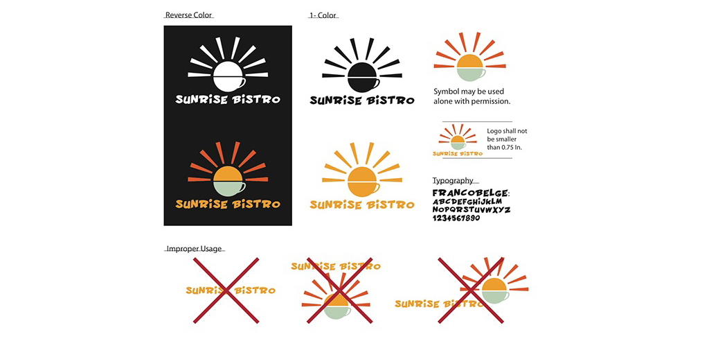
The logo is the symbolic character of a brand and company that can often be misused. Creating a clear usage guideline is essential to maintaining that identity and offering multiple size and acceptable color variations can go a long way in solidifying a well-structured brand. Perhaps just as important is giving examples of forbidden logo usage and adaptations.
Color Palettes
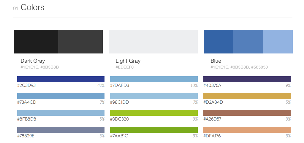
Defining the range of colors for a digital website, mobile application, print or any other design medium is really a given. Every style guide needs to present an inclusive palette with CMYK, Pantone and RGB alternatives for web and print. An eye-catching swatch is not necessary but can add some much needed pizazz to your guide.
Fonts
Equally important to displaying a comprehensive color palette is solidifying a clear typeface to be used on all channels. Be sure to include size, line height, colors, headings, weights, and even alternatives for non-web fonts. Typography can often make or break a design, so choose wisely and be sure to document your typeface with strong specifics like above.
Buttons
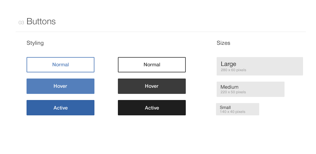
A great habit to form is thinking of every possible scenario or instance a client would need to use a button and give a clear visual of the default, hover, and active/visited state for each of those buttons. They are often used as call to actions and it is critical that the client has no need to implement their own styles on any of these states.
Other Items
There are a few other components that are important to include in your Style Guide. If you are dealing with a large company website, it is often extremely helpful to both you and the client to dedicate a page that includes code snippets for common elements that can be easily copied and pasted wherever needed. The CSS styles for these elements should apply globally to maintain that consistency and will in turn save you future strife.
Icons are a very common entity in both print and web applications. They draw interest to the user and often can drive home the context of the given talking point. Defining the size and space allotment for the icons is another excellent way to promote uniformity. It is also worth noting, don’t be shy in explicitly stating that the client should use icons sparingly and only when they serve a real purpose.
The Takeaway
As in with nearly all aspects of design, putting your own touch on a Style Guide can really personalize the look for the client. This blog is simply to inform you of some solid practices that will serve you well in creating a clean, professional outline for you and your customer to use. A few more good behaviors to leave you with:
- Cover it Up! – Include a cover page that highlights the logo and best practices when using it
- Make it Printable – You never know who will want to use it for reference and not just staring at a computer
- Plan for the Future – Design the guide in such a way you can make on the fly edits and client requests
- Make it Gorgeous – Pretend everyone you know, all your bosses and the client’s will be looking at it daily. Make something you are proud of and don’t be afraid to add some flare that will likely inspire others to design with a passion!


